
Goodreads: an interface refresh
Goodreads serves as a digital hub for the reading community. Users explore genres and recommendations to add to their wish lists, log their reading habits, and engage with friends and users with similar reading interests.
In this project, I redesigned the Goodreads interface geared towards the user goals found through research. I designed flows to make achieving those user goals easier and more intuitive, lessening frustrating pain points to promote further engagement with the application.
research > brainstorm > prototype > test
research
customer journey map
I began this project by creating a customer journey map through a user’s introduction to and first impression with the Goodreads app. Each step included a user’s thoughts, emotions, action, and touchpoint with the application.
This exercise serves to get into the user’s shoes and focus the research on how a typical user would interact with & feel about the interface. It reveals areas that are pleasurable or frustrating experiences, leading the researcher to see what pieces work and what needs improvement.
The customer journey map revealed user difficulty in executing a primary service the app advertises itself as providing — logging what books the user is reading — pointing to the app’s architecture as an area to view and critique.
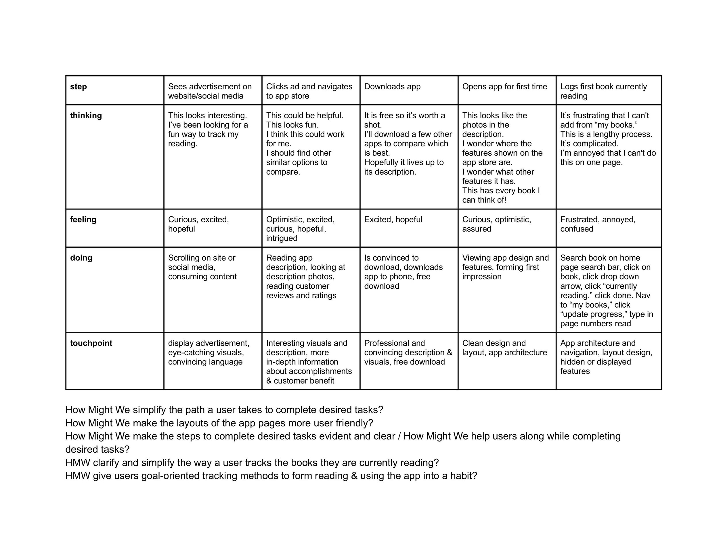
Click the image to open a PDF version of the customer journey map.
competitive analysis
I opened 4 other apps (2 direct & 2 indirect competitors) related to finding, reading & tracking books to compare and contrast Goodreads with others in the industry it serves. I assigned scores to all of the apps’ interfaces & usability based on a predetermined criteria surrounding the goals a user may have when interacting with an app like Goodreads.
10 actions were analyzed: creating & viewing account; saving a book to user’s library; viewing user’s library; saving a book to user’s wishlist; viewing user’s wishlist; finding book reviews; creating book reviews; setting & viewing reading goal; tracking amount read; and book recommendations. All of these actions were graded on a scale of 0 to 3. 0 signifies “there is no obvious and accessible option for the function.” 1 signifies “an option for the function exists, but is not completely accessible or obvious.” 2 signifies “an option for the function exists and is obvious, but not easily accessible.” Finally, 3 signifies “the option for the function is obvious and easy.”
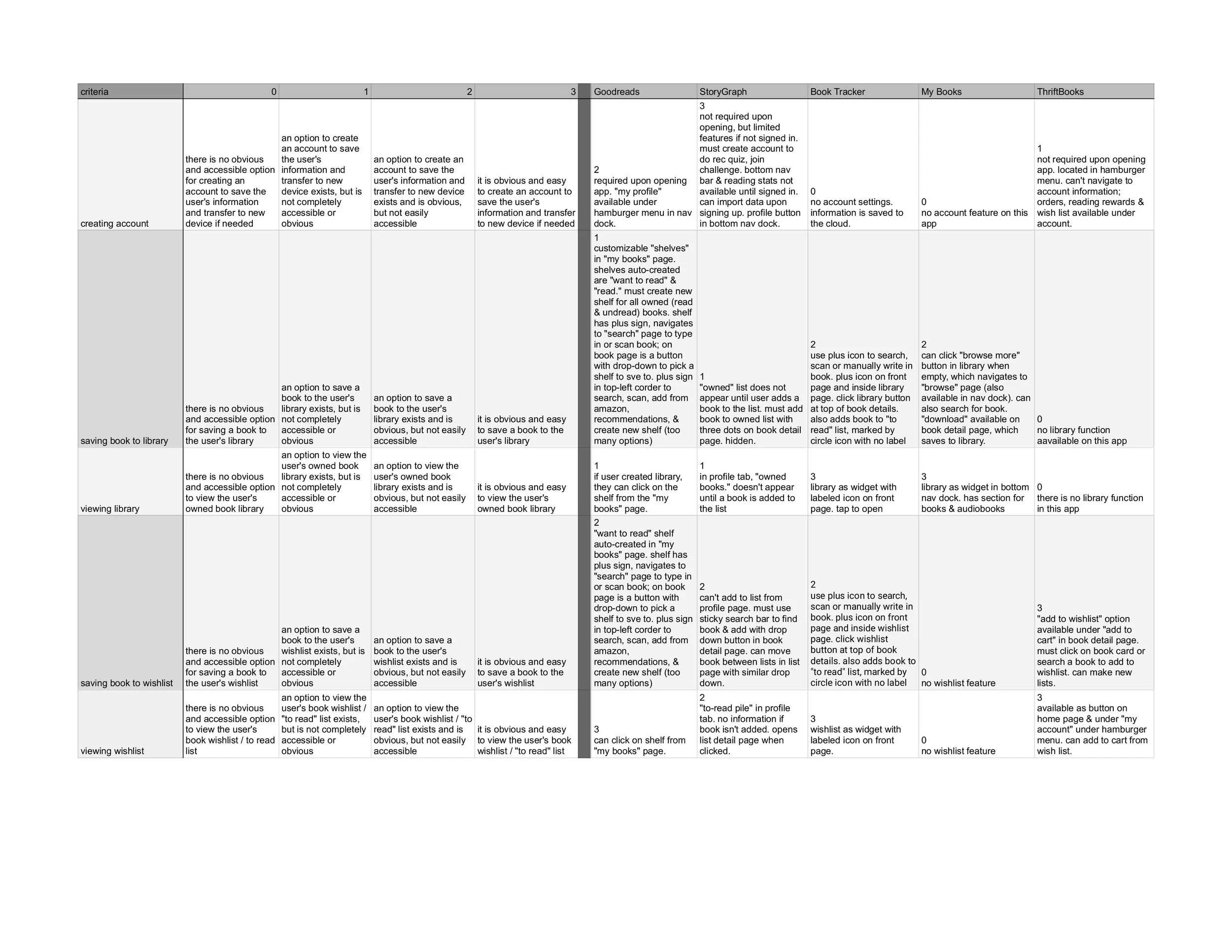
Click the image to open a multi-page PDF version of the competitive analysis notes.
contextual interviews
I conducted interviews with four individuals to discuss their reading habits. These participants ranged in age from young- to middle-aged adults, and were either employed or enrolled in university. I prepared 11 scripted questions to ask the participants to learn about their reading habits and book ownership, which can be read in the ‘contextual interviews summary PDF’ linked to the button below.
Three main types of potential users stood out during these interviews: avid readers looking to track their progress and goals and connect with a reading community; occasional readers looking for the best recommendations and prices to widen their tastes; and nonreaders looking to sell books they do not use.
Common user goals shared by the interviewees included the following:
enhancing engagement with reading habits
tracking pages read and progress in stories
connection with a reading community
utilizing an organization method for books
The user persona created for the remainder of the project drew inspiration primarily from the avid readers who were most likely to use an app to track reading habits & find inspiration from, though the persona does include traits from all of the kinds of readers discovered through the interviews.
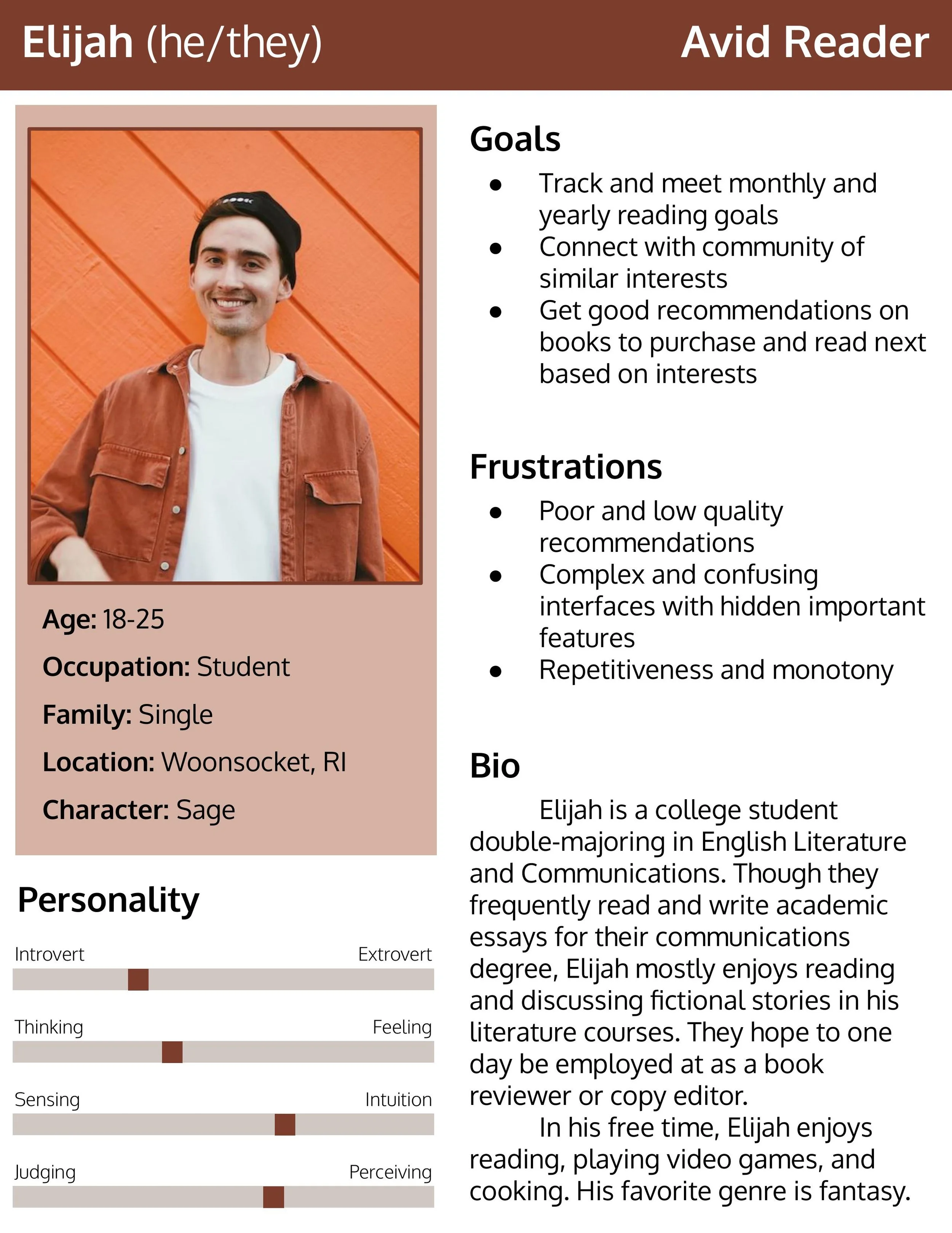
Click the image to open a PDF version of the user persona.
brainstorm
crazy eights
I focused on the opportunities surrounding tracking goals and organizing book lists, since these were ideas expressed as important in my user interviews. The three concepts I brainstormed for are sorting and organizing books on a user’s bookshelf by different categories based on the user’s need; tracking reading progress and seeing this reflected through goal progress; and adding a “community” feature for readers to have a virtual book club-esque experience to discuss novels or genres of interest with others.
I divided a page into eight sections and spent 1 minute on each, brainstorming possible touchpoints, layouts & flows to achieving the three concepts mentioned above. I practiced this exercise twice for a total of 16 ideas for what screens in the redesigned app may look like & contain.
Click the image to open a 2-page PDF version of the Crazy Eights exercise.
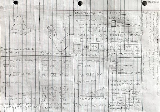
storyboards
I created storyboards for two tasks a user may want to complete within the app, which are two of the three user goals worked on in the remainder of the project. I drew the steps to complete these tasks in a numbered comic strip style.
The first story I worked through was logging page progress for a book the user is currently reading. The second storyboard shows the user adding a newly purchased book to their owned books library.
I struggled deciding on the correct order the steps should be completed in, which is why I listed each of the steps involved in the process to the side before drawing them out. This gave me a chance to organize my ideas into a natural and logical order.
In this stage I tried to focus more on the idea behind each of the steps rather than the layout of the app, which I focused on more in the final phase of my design concepting.
Click the image to open a two-page PDF version of the storyboards.
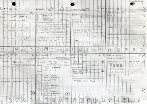
iterations
I sketched out multiple versions of a majority of the screens to include in the app wireframes. Using the best ideas I came up with in the Crazy Eights exercise, and keeping in mind the user’s needs when working through a desired task, I developed different versions of the screens a user would see when navigating through the app.
Click the image to open a two-page PDF version of the screen iterations.
prototype
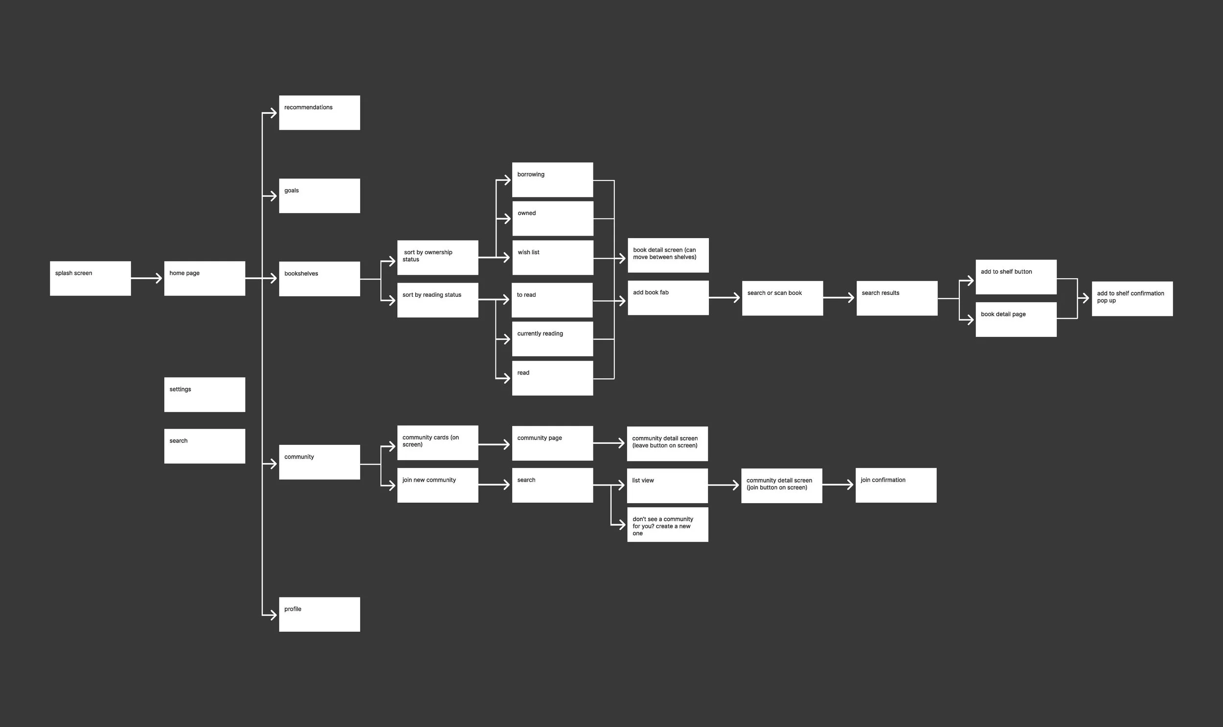
page architecture
Using a flow-chart layout, I created an order for what pages a user will be able to access from other pages. This page architecture chart shows the journey a user will take to achieve two of the prioritized user goals through the app redesign, being adding a novel to the user’s “bookshelf” (saved list of books), and joining a reading community.
Click the image to open a PDF version of the page architecture.
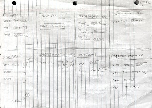
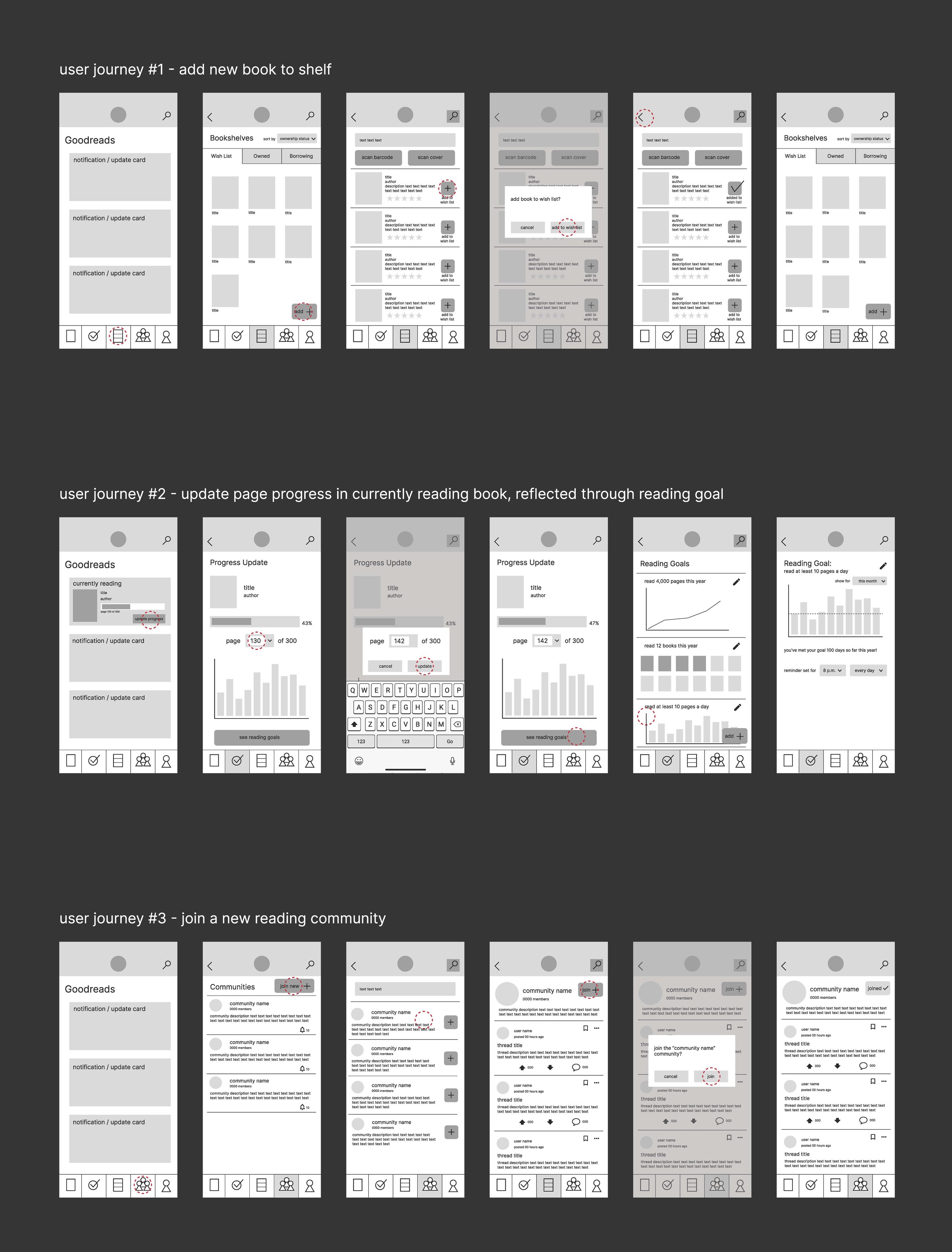
lo-fi wireframes
I created storyboards for two tasks a user may want to complete with the app. I drew the steps to complete these tasks in a numbered comic strip style.
The first story I worked through was logging page progress for a book the user is currently reading. The second storyboard shows the user adding a newly purchased book to their owned books library.
I struggled deciding on the correct order the steps should be completed in, which is why I listed each of the steps involved in the process to the side before drawing them out. This gave me a chance to organize my ideas into a natural and logical order.
In this stage I tried to focus more on the idea behind each of the steps rather than the layout of the app, which I focused on more in the final phase of my design concepting.
Click the image to open a PDF version of the lo-fi wireframes.